
Cool graphics for designers in 2025
Visual design trends and links to my favorite design inspirations

Before we start
We are in March. Is it too late to learn about visual design trends in 2025?
No!…if there is a small voice telling you it will be worth it. The same should apply to everything we decide to do/ commit to.
Let curiosity or enthusiasm guide our paths, whichever one arrives first.
This approach is fun, and lets us develop our own point of view. I’m trying to stay careful to not let too many popular conceptions sneak into my life to run it without me being aware. Having a point of view exercises my intelligence, and reduces the chances that I step into things half-heartedly.
Having a point of view is also the theme for this post about graphic design.
What’s the problem with generic graphics?
LinkedIn is a hot spot where too many generic AI-generated images are on display. They look like digital paintings- too smooth and too perfect. Such images always catch my eyes to pause quickly before I recognize they are generated by AI. I then move on with dissatisfaction.
The experience of encountering these images feels ingenuine to me. Many of the images look as perfect as they are generic. There is no unique point of view, no interest to initiate real communications from the image creator. They are blobs of emptiness wrapped up with skillfully executed lines and colors.
The image feels generic because the message is a pre-made one. Few decisions is made by the creator.
AI has made creating images more accessible than ever. This means we will see even more generic images on the Internet. We will crave for things that look less like they are mass-produced. Visuals that feel unique and personal will stand out - this becomes more true than ever. A good visual design:
Has an attitude: It can be loud and fun, luxurious and extravagant, dark and mysterious. It’s okay even if it’s just ugly. Ugliness is subjective. If I had fun creating it, it is likely the graphic will resonate with someone!
Leaves a message: It is the job of visual design. Evoke an emotion or a thought. Make people feel (e.g., curious, nostalgic, relaxing, and fun).
The trends and my favorites:
I learned about the visual trends in 2025 from here, here, here, and here.
I’m the most excited about following 4 trends. I encountered them repeatedly across different sources. They have so much personality. I think experimenting with them is going to be very fun.
1. Retro is here to stay: from the 50s to the 00s.
Jenny Lezan is a multidisciplinary designer and owner of Bella+Sophia Creative studio. She broke down the elements of this reinvented retro aesthetics:
“…this trend is all about mixing old school influences with more modern styles to create this warm and familiar feeling. Designers are drawing inspiration not only from visuals and concepts, but even from retro color palettes," such as the muted tones of the 70s, the vibrant neons of the 80s and the grungy shades of the 90s.”
Personally, I find the most comfort and sense of belongings with the 90s aesthetics. I also like the visuals created in the 70s and 80s, but without living through these eras in the western world, I feel hesitant that my creations might not reflect the cultural history of these times (but I’ll still try). 00s visuals feel too plastic - maybe I haven’t looked into it broadly enough. For now, it’s not for me.
When I think about graphic design in the 90s, MTV idents come to mind. It is nostalgic for me. Growing up in China, watching MTV in the 90s is my first contact with graphic design in the western world. I was fascinated by the colors, the music, and the weirdness in those idents. I can’t get enough of it. Now, they are good sources of inspirations:
But, honestly, I think this compilation of 80s idents are cooler, and more fun:
This is how I will use these inspirations to create my own:
Find the clips I like, screenshot frames, and make a moodboard of them (I usually create such moodboards in Figma.)
Identify the elements I like about these visuals: Is it colors, textures, typography, graphics/photos, or the compositions?
Take notes during step 2, and possibly re-group the images based on my notes for cleaner organization to make it easier for future re-use. (I use Figma for this purpose.)
Understand why I like these elements (this could happen in step 3 when taking notes): once I know why, it would be easier for me to add my own expression to make these elements serve my design better.
Next, let’s take a look at how designers bring their own twists into these styles.
I’m loving this music video for Bruno Mars and Anderson .Paak’s collaboration. The muted red, brown, yellow, oranges and stage lighting setup all bring back the 70s vibe. And the comedy is so good!
Besides the colors in this video, I find the image composition most exciting to me - I’ll be making screenshots of 0:49, 2:35 (the star-shaped reflection on his sunglass is 🤌) and 2:39. I don’t know when I will use them, but I think these compositions add variety to what I can do, and can create interesting effects to ordinary images.
A good recent example of leveraging the retro aesthetics are the graphics by Perplexity AI. They look similar to the retro sci-fi covers from the 50s to 80s, which you could find plenty examples on Instagram and Pinterest.
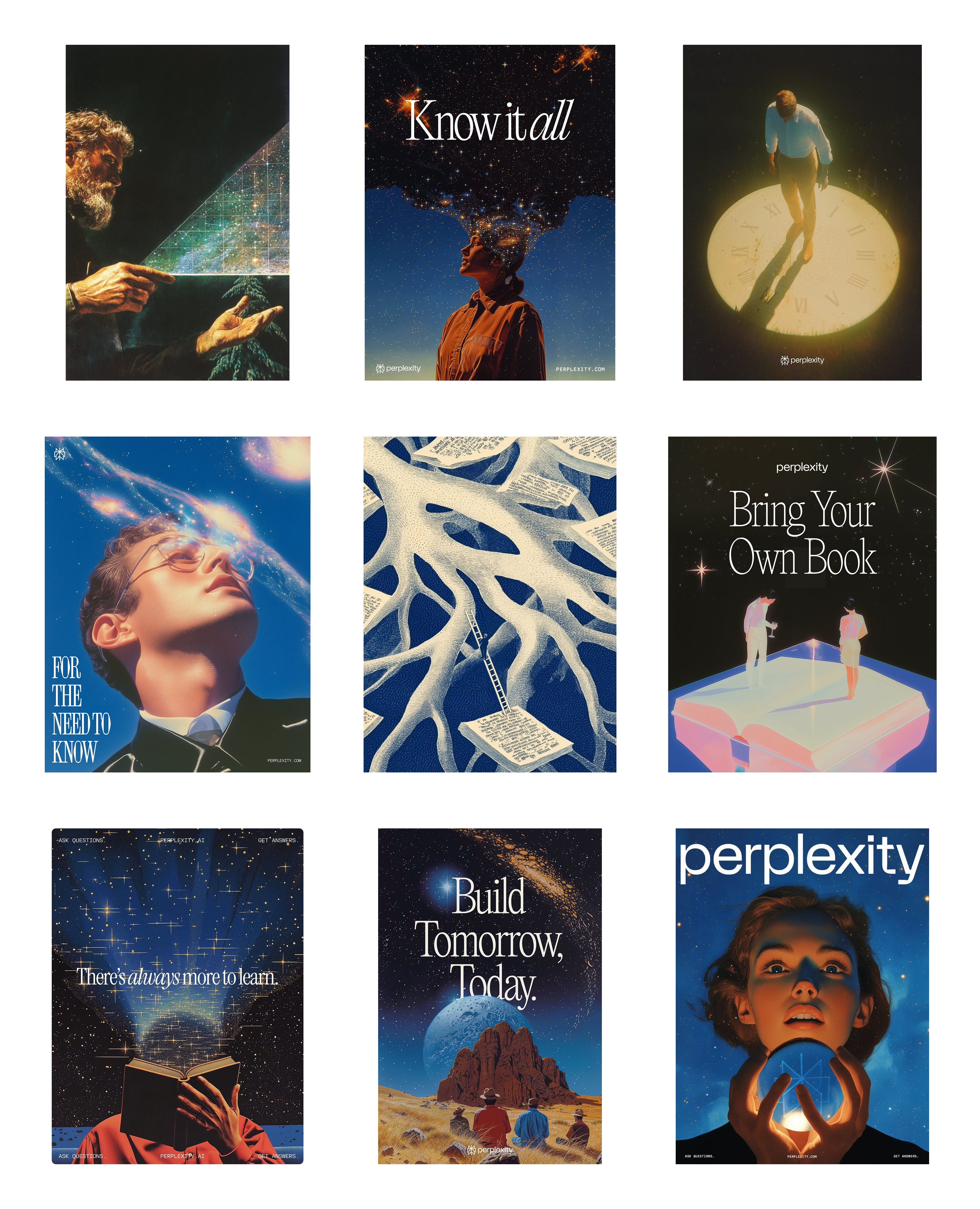
I highly recommend checking out the work by designer Phi Hoang and Tatiana Tsiguleva. Tatiana also shared the Midjourney style reference in her X post for the image in the center of the picture above. I used it to create the thumbnail for this blog post.
I like the use of retro sci-fi aesthetics for Perplexity because AI has been a theme for science fiction, so it makes a lot of sense to reference it for an AI product.
The muted tones of these images makes the futuristic message feel cozy. If the design adopted a more sleek aesthetics, it would have felt too tech-broey. For an AI product, it is smart to not be associated with tech bros, who have a reputation of behaving recklessly from the ethical and financial standpoints. This would have repelled some people who have concerns about the ethical and financial aspects of AI products.
The sparkles/ stars have also been a common element across these images. I think it signals optimism for exploring the unknown possibilities. It doesn’t feel like it’s over-used yet.
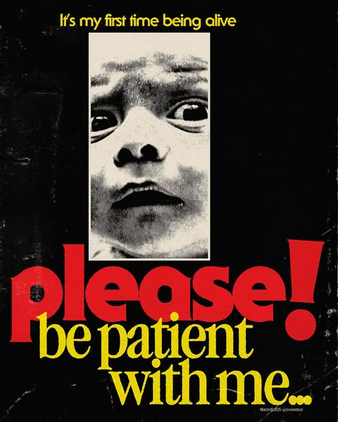
2. Grainy graphics and photos
Grains on images immediately give me a sense of sophistication, possibly because it signals it’s something that lives in the past. For me, it expresses nostalgia and melancholy. It would also be worth a try to mix it with elements that don’t express these emotions. It may create some surprising effects.
Grainy images could be categorized in the retros design section, but I think it’s so versatile that it can live well outside of the retros aesthetics. If I don’t know what else I can do to add more interest to an image, I would try to add grains first as a short-cut to make the graphic look like it’s more “designed”. The texture adds depth.
It also adds realness and uniqueness. For photos specifically, the grainy texture reminds people of the photos taken with film cameras. Using cameras is a choice today. Taking a flawless photo with our phones is not - it’s the easy default. This is specifically true for Gen Z. As digital natives, they are over the polished Internet. Imperfect images are an expression of how they want to shape their identities.
Here are some graphics I enjoy:
Retro sci-fi/ retro futurism (similar to Perplexity’s style): https://www.instagram.com/p/DGliq3EsR3R
I really like this designer’s work for its grungy style, which is less common today, and it communicates clear emotion every time:
More of this designer’s work:
a. https://www.instagram.com/p/CpRitiOOOME/?img_index=1
b. https://www.instagram.com/p/CrOrLY8vN0s/?img_index=1
c. https://www.instagram.com/p/Cx6C1ctPBTq/?img_index=1
d. https://www.instagram.com/p/C2xqoVXPIpO/?img_index=1
e. https://www.instagram.com/p/C6uHFwqP2hu/
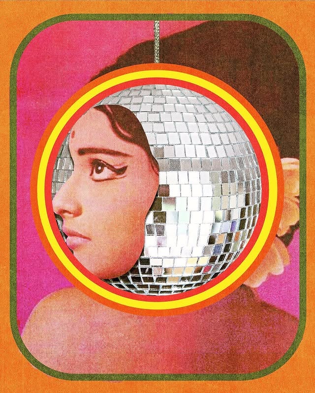
3. Collages: under-explored gems for digital designers (imo)
I haven’t made any collages, but am always drawn to this art form. I think it’s time to give it a try. They are tactile and full of characters. Using them in digital design will make the project standout.
A few examples that got my attention, and I will try to imitate:
I like the vibrant colors, and feminine and quirky energy in these:
More of this designer’s work:
a. https://www.instagram.com/p/C-oOnq2xpcj/?igsh=cDFpdG5sMDY1Znc0
b. https://www.instagram.com/p/CwDLZr8OaTD/?igsh=MTg5ZzFhM3R0bDAycw==
c. https://www.instagram.com/p/CoLD_ylOUlj/?igsh=dzFod2VsY2dud29o
Break the patterns:
This reminds me of Monty Python:
I think this counts as collage? It’s also a less common style to see today:
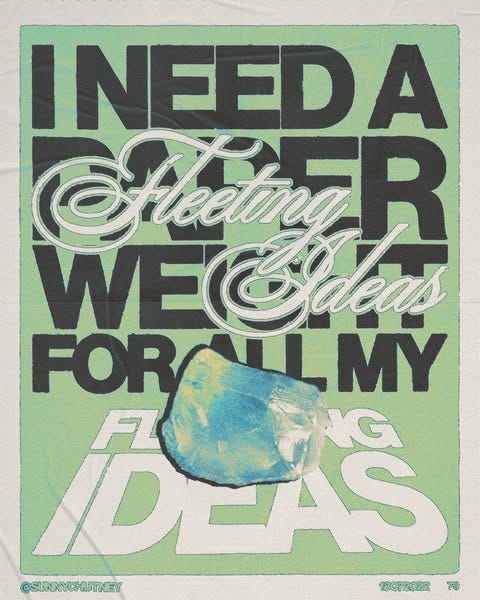
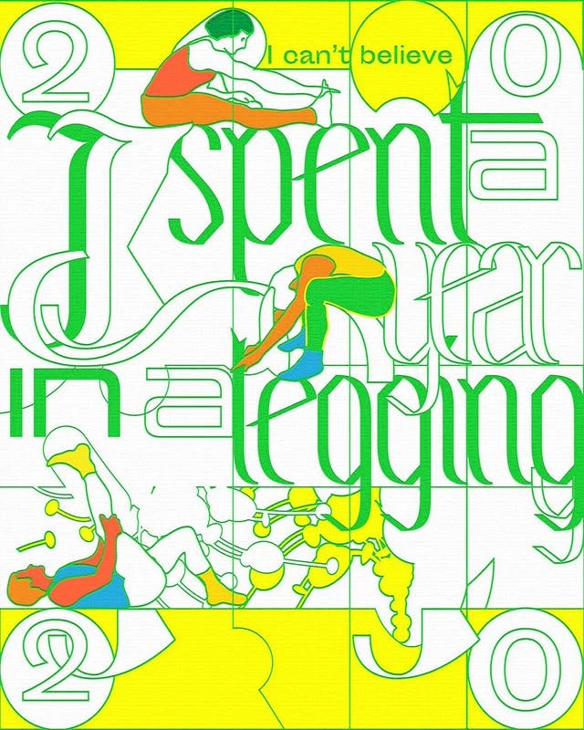
4. Expressive use of typography
Need I say more? Putting a cool font on a blank paper or a mediocre design will make it look 10 times better. Case in points:
Mixing fonts is fun:
More examples:
a. https://www.instagram.com/p/C9P27EPpZWE/?igsh=MTlpeDltNDh3Y3Y3OQ==
b. https://www.instagram.com/p/CpguLa0s1gJ/?utm_source=ig_web_copy_link
c. https://www.instagram.com/p/CnHcREKJKSV/
Interesting fonts lays on top of photos or vibrant color - how to make things look like they are “designed”:
Interesting composition for typography:
Simple to do, but very quirky:
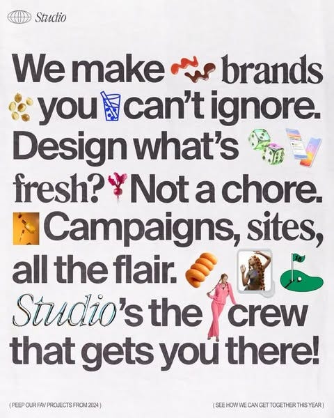
Crazy good combination of typography and illustration:
Quirky typography motion graphic. May take some time to figure out how to create:
Typography motion graphic if you need to add interest to your design quickly:
Good read, and a tip to learn motion design faster is reverse engineering a motion graphics reference using perplexity or gpt and requesting steps in figma or after effects. I did this the other day and surprised myself with the results
I dig this post. Design and typography are sooooo interesting to learn about.
Don’t love the use of AI personally and try to avoid it, my 2¢.
Love the use of collage. Creates an analog feel that a lot of people are chasing. I’ve been seeing a ton of collaging in psychedelic rock and dream pop album art, which is so fun to see!
Keep up the good work!